When summer hits, your home should feel like a retreat—cool, refreshing, and effortlessly stylish. Choosing the right paint colors can instantly transform your space, making it feel lighter and more inviting. In this article, I’ll walk you through the best summer paint color ideas that not only elevate your design but also help keep your home cooler during those hotter months. Let’s explore the shades that truly work with the season, not against it.
Why Paint Colors Matter in Summer
You might not think twice about the impact paint colors can have, but in the summer, they play a surprisingly powerful role. Light colors reflect more sunlight, which means your rooms stay cooler—especially when that sun beats down all day. On top of that, fresh paint can give your home a much-needed seasonal refresh.
Whether you’re updating a single room or giving your whole home a summer makeover, paint sets the tone. It influences how a space feels emotionally and physically. Cool tones can make a room feel airy, while bright hues can energize without overwhelming. So, choosing the right palette isn’t just about trends—it’s about comfort, function, and feeling good in your space.
Soft Neutrals: Always in Style and Easy on the Eyes
Let’s start with a classic—soft neutrals. Think warm whites, light taupes, and sandy beiges. These tones work well in almost any space and bounce natural light beautifully. If you’re unsure where to start, this is the safest (and most versatile) color family for summer.
What makes soft neutrals great is their ability to make a room feel clean and expansive. They’re perfect for open floor plans, entryways, and living rooms. Plus, they act as a subtle backdrop that lets your furniture and decor do the talking. If your style leans toward coastal or minimal, these shades will bring that calm, breezy energy inside—without looking washed out.
Cool Blues: Bring in That Ocean Breeze
Summer and cool blues go hand in hand. Light blues, sky tones, and dusty aquas immediately evoke feelings of water and fresh air. These shades help visually cool down a room and make it feel more open and relaxed.
Try using light blue in a bedroom to promote calm and sleep or in a bathroom for a spa-like effect. Want something slightly bolder? Go with a soft teal or a washed denim tone for accent walls or cabinets. The key is to keep the saturation soft and avoid heavy navy tones in smaller rooms unless you’re using them as a statement.
What’s more, blues pair beautifully with natural elements like wood, linen, and plants. You can almost hear the waves crashing once the color hits the wall.
Fresh Greens: A Natural Way to Cool Things Down
Another summer favorite? Fresh greens. Pale sage, mint, and olive are having a real moment—and for good reason. These shades pull in the beauty of the outdoors while helping your home feel more serene and shaded.
Green is a naturally balancing color. In design, it bridges warm and cool tones, making it ideal for transitional spaces like hallways, kitchens, or sunrooms. Light green shades reflect plenty of sunlight without looking too bright or sterile. And unlike some trendier colors, green always feels grounded and timeless.
Use it to complement natural woods, white trim, or even metallic accents. A quick coat of sage green on a bathroom vanity or mint on a bedroom wall might be all it takes to bring some refreshing summer energy indoors.
Sunny Yellows: Add Energy Without Overheating
You might think yellow is too bold or bright—but the right soft yellow can make a space feel cheerful and summery without going overboard. The trick is to go for buttery tones, muted mustards, or pale lemons. These colors give you that sunshine vibe without creating visual heat.
Yellow works beautifully in kitchens, breakfast nooks, and creative spaces like home offices or art studios. It encourages positivity and focus—two things we all could use more of. When paired with crisp white trim or natural textures like rattan or jute, yellow tones can bring warmth without adding physical warmth to the room.
Don’t be afraid to test out a few swatches. You’ll be surprised how sophisticated soft yellows can feel when used correctly.
Crisp Whites: The Ultimate Summer Reset
Sometimes, a fresh white coat of paint is exactly what your space needs. White may sound simple, but there are dozens of undertones—from cool blue-whites to creamy ivories—that can subtly shift the vibe of your room.
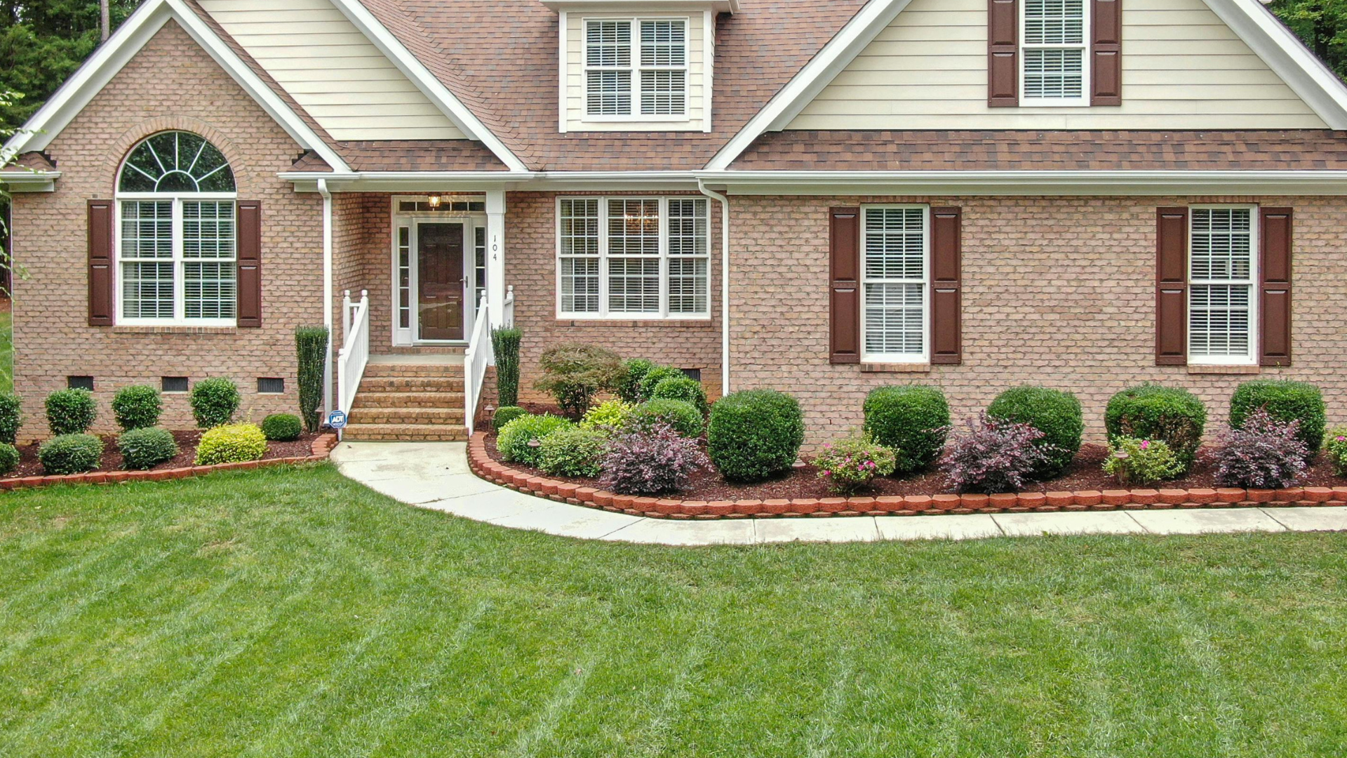
In the summer, bright whites help reflect light and make small spaces feel bigger. They create the perfect canvas if you love to switch out seasonal decor—think light curtains, beachy art, or tropical plants. White is also ideal for exteriors, giving your home that clean, timeless look with serious curb appeal.
Just be sure to choose a white with the right undertone for your light. North-facing rooms may benefit from warmer whites, while south-facing ones can handle cooler whites to counterbalance direct sunlight.
Accent Walls and Two-Tone Techniques
If you’re not quite ready to commit to a full-room color change, consider an accent wall or a two-tone paint strategy. This allows you to bring in a summer shade without overwhelming the space.
Accent walls work well behind beds, in dining areas, or even on ceilings. Want something more modern? Try painting the lower half of the wall in a deeper shade and keeping the upper half light—this “color-dipped” look adds dimension and style while keeping things fresh.
Two-tone techniques also give you the flexibility to mix bold and neutral colors, creating visual interest while still keeping that light, summer feel.
Don’t Forget the Finish
When choosing summer paint colors, finish matters just as much as color. For bright, sunlit rooms, eggshell or satin finishes reflect just the right amount of light without showing every fingerprint. High-gloss can be too shiny and harsh in natural light, while flat finishes may dull the effect of lighter shades.
If you’re painting high-traffic areas like hallways or kitchens, choose finishes that are easy to clean and stand up to humidity. Bathrooms, especially in East Texas’ climate, benefit from mold-resistant finishes that help you keep things fresh all season long.
A Quick Word on Color Psychology
It’s not just about looks. Color impacts your mood and energy levels, too. Lighter shades often make you feel more relaxed and refreshed—perfect for the laid-back vibe summer should bring. Blues and greens are known to lower stress, while yellows encourage creativity and optimism.
So when you’re selecting a summer color, think beyond aesthetics. Ask yourself: How do I want to feel when I walk into this room? Let that guide your decision.
When You Want It Done Right…
If the idea of choosing and applying paint feels overwhelming, don’t worry—you’re not alone. Painting can be tedious, and picking the perfect shade that complements your lighting, furniture, and layout takes experience.
That’s where we come in. At Home Projex, we specialize in transforming East Texas homes with high-quality paint jobs tailored to your style and climate. Whether you’re going for a whole-home refresh or just sprucing up a few rooms, we’re here to make sure the job gets done right the first time. No mess. No stress. Just a clean, cool space you’ll enjoy all season long. Reach out to us today for a free consultation.
Wrapping It All Together: Paint Your Summer in Style
Choosing summer paint colors isn’t just about following trends—it’s about creating a space that feels cool, comfortable, and unmistakably you. Whether you lean into soft neutrals, calming blues, earthy greens, or cheerful yellows, the right palette can make your home feel like a seasonal retreat.
So as the temperatures rise, take a fresh look at your walls. A simple color change might be all you need to brighten up your space and beat the summer heat.